- Published on
Build Dynamic Themes in Next.js with Tailwind & Shadcn UI
- Authors
-
-
- Name
- Jitendra M
- @_JitendraM
-
Table of contents:
-
✅ What We’ll Cover
-
📁 1. Create a New Next.js App
- 🧱 2. Initialize Shadcn UI
- 🎨 3. Setup Multiple Custom Themes (Light + Dark)
-
🪄 4. Add Global Theme Styles
-
⚙️ 5. Tailwind Theme Tokens Setup
-
💡 6. Theme Provider Setup in Layout
-
🧭 7. Create a Theme Switcher Component
-
✅ 8. Final Result: Live Multi-Theme Switching
-
Try It Yourself
- 🧠 Conclusion
-
Explore More Topics
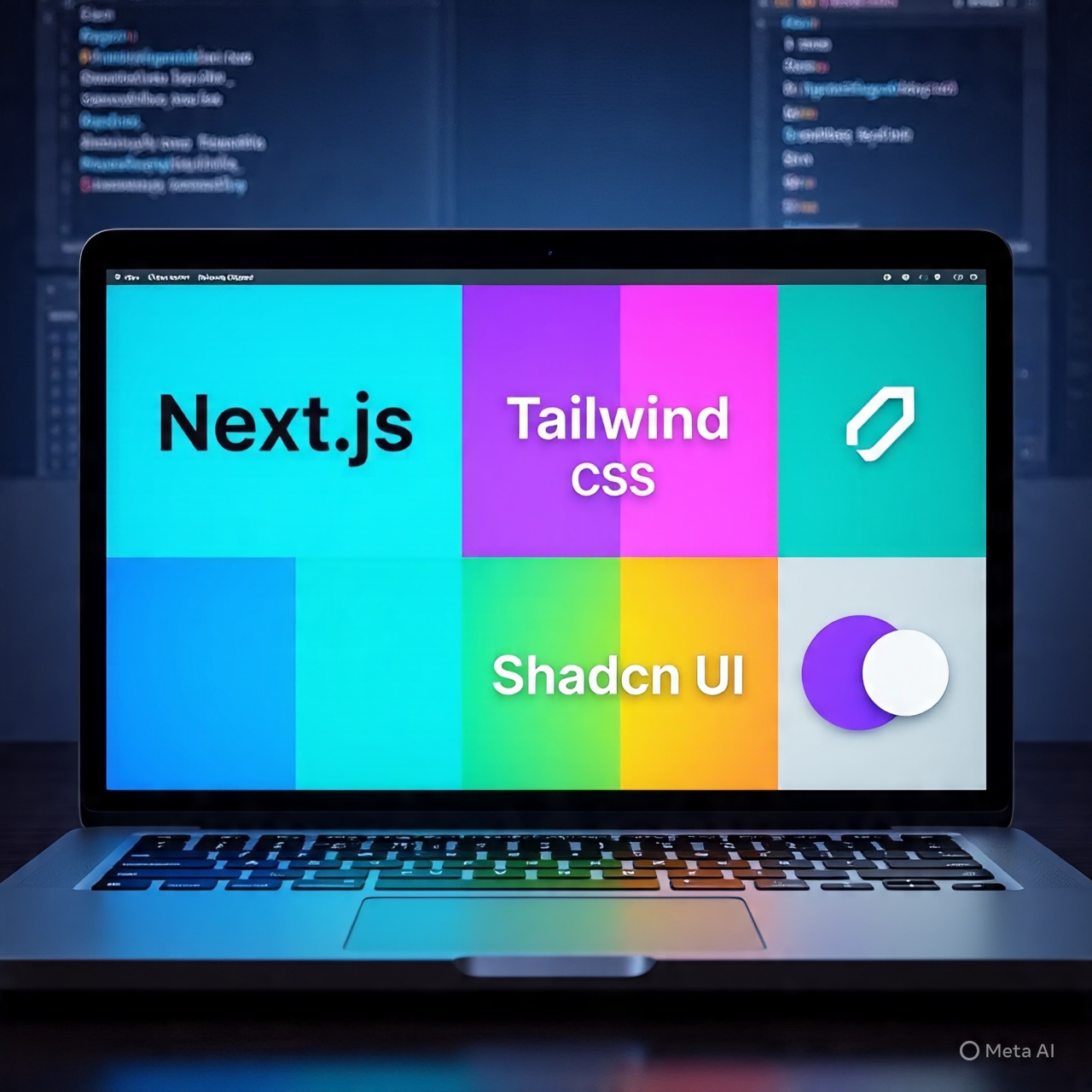
🚀 Build beautiful and dynamic multi-theme UI in Next.js using Tailwind CSS and Shadcn UI with full light/dark mode support. This guide walks you through everything from scratch — no prior experience needed!
✅ What We’ll Cover
- How to create a new Next.js project
- Install and configure Tailwind CSS
- Add Shadcn UI components
- Setup Multiple Light/Dark Themes
- Use
next-themesfor theme switching - Build a working theme switcher buttons
📁 1. Create a New Next.js App
We’ll use the official create-next-app tool to scaffold the project:
npx create-next-app@latest
You’ll be prompted with a few questions:
✔ What is your project named? … my-app
✔ Would you like to use TypeScript? … Yes
✔ Would you like to use ESLint? … Yes
✔ Would you like to use Tailwind CSS? … Yes
✔ Would you like your code inside a `src/` directory? … Yes
✔ Would you like to use App Router? (recommended) … Yes
✔ Would you like to use Turbopack for `next dev`? … No
✔ Would you like to customize the default import alias? … Yes
✔ What import alias would you like configured? … @/*
📦 Your folder structure will now include Tailwind and App Router setup out of the box.
🧱 2. Initialize Shadcn UI
Shadcn UI gives you beautiful, accessible components that work perfectly with Tailwind.
Run the init command:
npx shadcn@latest init
You’ll be prompted to set up Shadcn in your project. Accept the defaults or adjust as needed.
🧩 Add First Shadcn Component
Let’s install the button component to verify setup:
npx shadcn@latest add button
✅ You’ll now see Shadcn components appear inside your components/ui/ folder.
🎨 3. Setup Multiple Custom Themes (Light + Dark)
We’ll now define multiple theme options like:
-
theme-blue-light,theme-blue-dark -
theme-red-light,theme-red-dark
We’ll use CSS variables, Tailwind tokens, and next-themes for switching.
📦 Install next-themes
npm install next-themes
🪄 4. Add Global Theme Styles
Inside your globals.css (or create a new file and import it), define theme tokens like this:
.theme-red-light {
	--radius: 0.625rem;
	--background: oklch(1  0  0); /* white */
	--foreground: oklch(0.15  0.03  30); /* dark grey text */
	--card: oklch(0.98  0.005  20);
	--card-foreground: oklch(0.15  0.03  30);
	--popover: oklch(1  0  0);
	--popover-foreground: oklch(0.15  0.03  30);
	--primary: oklch(0.55  0.25  30); /* rich red */
	--primary-foreground: oklch(1  0  0); /* white text on red */
	--secondary: oklch(0.93  0.03  20); /* light red tint */
	--secondary-foreground: oklch(0.25  0.05  30);
	--accent: oklch(0.93  0.03  20);
	--accent-foreground: oklch(0.2  0.05  30);
	--muted: oklch(0.95  0.005  20);
	--muted-foreground: oklch(0.45  0.01  30);
	--border: oklch(0.9  0.01  20);
	--input: oklch(0.9  0.01  20);
	--ring: oklch(0.55  0.25  30);
	--destructive: oklch(0.6  0.28  27);
	--destructive-foreground: oklch(1  0  0);
}

.theme-red-dark {
	--background: oklch(0.15  0.03  30);
	--foreground: oklch(0.98  0.01  20);
	--card: oklch(0.2  0.02  30);
	--card-foreground: oklch(1  0  0);
	--popover: oklch(0.2  0.02  30);
	--popover-foreground: oklch(1  0  0);
	--primary: oklch(0.65  0.25  30);
	--primary-foreground: oklch(1  0  0);
	--secondary: oklch(0.4  0.05  20);
	--secondary-foreground: oklch(0.98  0.01  20);
	--accent: oklch(0.4  0.05  20);
	--accent-foreground: oklch(1  0  0);
	--muted: oklch(0.3  0.01  20);
	--muted-foreground: oklch(0.7  0.02  20);
	--border: oklch(0.25  0.01  20);
	--input: oklch(0.25  0.01  20);
	--ring: oklch(0.65  0.25  30);
	--destructive: oklch(0.65  0.25  30);
	--destructive-foreground: oklch(1  0  0);
}

/* Add more themes like blue, green, etc. */
⚙️ 5. Tailwind Theme Tokens Setup
In your tailwind.config.ts, extend colors with CSS variable references:
theme: {
  extend: {
    colors: {
      background: "hsl(var(--background))",
      foreground: "hsl(var(--foreground))",
      primary: "hsl(var(--primary))",
      secondary: "hsl(var(--secondary))",
      accent: "hsl(var(--accent))",
    },
  },
},
This allows you to use classes like bg-background, text-foreground, etc.
💡 6. Theme Provider Setup in Layout
Wrap your app/layout.tsx with a theme provider:
import  type { Metadata } from  "next";
import { Geist, Geist_Mono } from  "next/font/google";
import { ThemeProvider } from  "@/components/theme-provider"
import  "./globals.css";

const  geistSans  =  Geist({
	variable:  "--font-geist-sans",
	subsets: ["latin"],
});

const  geistMono  =  Geist_Mono({
	variable:  "--font-geist-mono",
	subsets: ["latin"],
});

export  const  metadata:  Metadata  = {
	title:  "Next Js Multiple Themes Demo",
	description:  "A demo showcasing multiple themes in Next.js using Tailwind css and shdcn UI."
};

export  default  function  RootLayout({ children,}:  Readonly<{
	children:  React.ReactNode;
	}>) {

	return (

		<html  lang="en"  suppressHydrationWarning >
		<body
			className={`${geistSans.variable}  ${geistMono.variable} antialiased`}>

				<ThemeProvider
					attribute="class"
					defaultTheme="theme-red-light"
					enableSystem={false}
					value={{
						light:  "theme-blue-light",
						dark:  "theme-blue-dark",
						"theme-blue-light":  "theme-blue-light",
						"theme-blue-dark":  "theme-blue-dark",
						"theme-red-light":  "theme-red-light",
						"theme-red-dark":  "theme-red-dark",
					}}
				>
				{children}
				</ThemeProvider>
			</body>
		</html>
	);
}
Create a component components/theme-provider.tsx with a theme provider:
"use client"

import  *  as  React  from  "react"
import { ThemeProvider  as  NextThemesProvider } from  "next-themes"

export  function  ThemeProvider({ children, ...props}:  React.ComponentProps<typeof  NextThemesProvider>) {
	return  <NextThemesProvider  {...props}>{children}</NextThemesProvider>
}
The theme-provider.tsx uses next-themes under the hood.
🧭 7. Create a Theme Switcher Component
Build a dropdown component ThemeSwitcher.tsx using Shadcn’s dropdown menu:
import { useTheme } from "next-themes"
import { DropdownMenu, DropdownMenuItem, DropdownMenuTrigger } from "@/components/ui/dropdown-menu"

export function ThemeSwitcher() {
  const { setTheme } = useTheme()

  const themes = [
    { label: "Blue Light", value: "theme-blue-light" },
    { label: "Blue Dark", value: "theme-blue-dark" },
    { label: "Red Light", value: "theme-red-light" },
    { label: "Red Dark", value: "theme-red-dark" },
  ]

  return (
    <div  className="flex flex-wrap gap-2">
			{themes.map((t) => (
				<Button key={t.value} variant={theme === t.value ? "default" : "outline"}
				onClick={() => {
					setTheme(t.value);
				}}
				className="text-xs">
					{t.label}
			</Button>

		))}

	</div>
  )
}
📍 Drop <ThemeSwitcher /> inside your homepage or header.
✅ 8. Final Result: Live Multi-Theme Switching
You’re now able to:
- Switch between multiple light/dark themes
- Use Tailwind classes like
bg-background,text-primary, etc. - Add more themes by simply defining CSS variables and listing them in your config
Try It Yourself
🎉 Want to see it in action?
🔗 Live Demo: next-js-multiple-theme-demo.vercel.app
📦 Source Code: GitHub - palactix/next-js-multiple-theme-demo
Fork, clone, and customize your own multi-theme setup easily!
🧠 Conclusion
Setting up multiple themes in a Next.js app doesn’t have to be hard. With Tailwind CSS, next-themes, and Shadcn UI, it becomes modular, scalable, and extremely flexible.
✅ SEO-Friendly Benefits
- Fast-loading with Tailwind CSS
- Multiple themes improve UX and engagement
- Works with App Router and SSR
- Mobile-friendly and accessible
If you’re building a SaaS dashboard, portfolio, or developer tool, this pattern is 100% production-ready.